
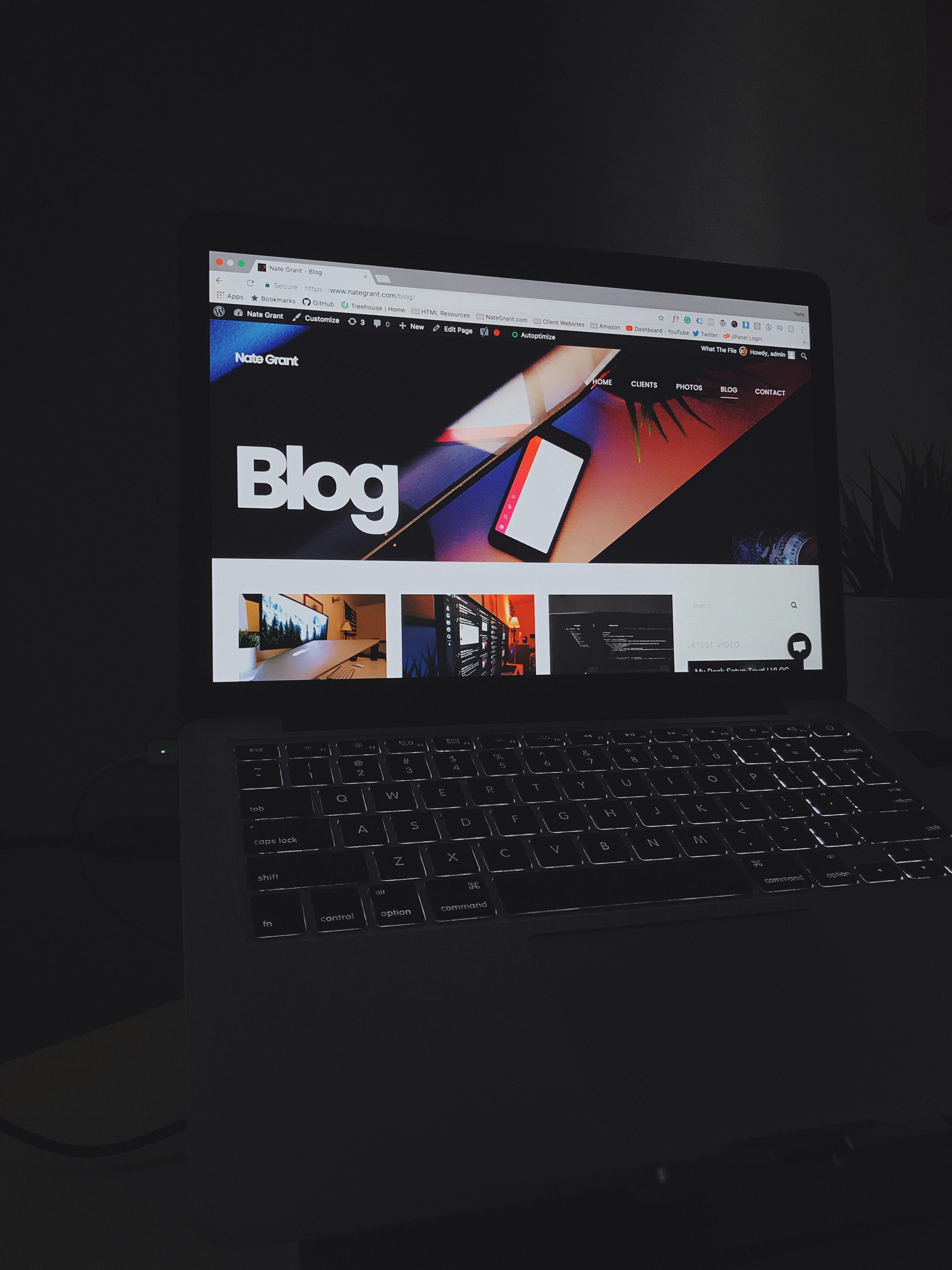
An image-first blog post places one prominent image at the center of the reading experience. Rather than treating a photograph as decoration or a thumbnail beside an article, this format gives the visual the first opportunity to communicate. A concise passage follows immediately, explaining what is shown, why it matters, or what a reader might otherwise miss. A single full-width image can establish place, mood, scale, detail, or a central idea before prose adds interpretation. The writing should deepen the image, not merely repeat visible facts.
This structure works especially well when the subject is inherently visual. Travel stories can use a scene to introduce a destination before describing its character; photography features can pair an image with the choices or conditions behind it. Project updates may show progress at a glance, while product articles can foreground a defining feature. Recipes benefit from a finished dish that invites readers into the process, and visual explainers can present a diagram or example before clarifying how it works. In each case, the image offers an immediate point of entry and gives the following text a clear subject.
A practical sequence begins with a headline that sets expectations, followed, if useful, by a brief introduction that frames the story without delaying the main visual. Place the full-width image next, then provide explanatory text directly beneath it. Supporting details—such as a caption, credits, ingredients, specifications, steps, or links—can follow when they help readers act on or understand the subject. Keep every element purposeful: the headline should orient, the introduction should prepare, and the explanation should add context or insight. Avoid lengthy preambles, competing graphics, and redundant descriptions. When the image and text work together, readers can move naturally from seeing to understanding.
Use this sequence as a flexible framework for an image-led blog post: begin with a clear headline, add a brief introduction if readers need context, present the main image, then place a focused text block immediately below it. The headline should signal the subject or promise of the post without competing with the image. An introduction of one or two sentences can set expectations, explain the image’s relevance, or help readers understand what they will learn. Omit it when the headline and image already provide enough orientation.
Display the image at full width where the page design allows, and choose a crop that preserves the important subject and visual context. Check how the image appears on both desktop and mobile screens; a crop that works in one layout may obscure key details in another. Use a suitable, high-quality file and provide image credit when required by the source, license, or editorial standards. Keep credit information visible and accurate, rather than leaving readers uncertain about ownership or attribution.
Place a text block directly underneath the image. Its first sentence should orient readers by identifying the image’s subject and, where helpful, its setting or moment. Subsequent sentences can add relevant details, background, interpretation, or a clear connection to the post’s central idea. Avoid merely restating what is obvious in the picture. Instead, explain why the image matters, what readers should notice, or how it supports the article’s point. Keep the passage concise enough to maintain a visual rhythm while giving readers meaningful information.
Optional elements can strengthen the layout when they serve a clear purpose. Add a caption to name a person, place, event, or detail that needs identification; use a descriptive subheading to introduce a new angle; and include a source note when readers may benefit from knowing where an image or claim originated. A call to action can invite a relevant next step, such as viewing a related guide. Do not add these elements automatically. Each should clarify, contextualize, or advance the post, rather than create clutter. Adapt the sequence to the material while preserving the essential relationship between image and explanatory text.
Text beneath an image should be grounded in what the visual actually contains, rather than relying on generic praise or broad observations. Identify the relevant person, place, object, moment, or process by name whenever the information is available. For example, instead of saying that a photograph captures “a busy scene,” specify who is working, where the activity takes place, and what task is underway. A precise reference gives readers useful information and helps connect the visual to the article’s subject.
Choose one detail that matters to the post and describe it clearly. This might be a tool in use, a change in a landscape, a gesture between people, or a stage in a process. Then explain how that detail relates to the larger topic. If an article discusses urban gardening, for instance, noting the compact raised beds in a particular community garden can lead into a point about making limited space productive. The detail becomes meaningful because the accompanying text interprets its relevance, not merely because it is visible.
Keep the caption distinct from the fuller paragraph beneath the image. A concise caption can identify the subject, location, date, photographer, or source; it should provide essential information without trying to carry the entire argument. The paragraph can supply context, explain a choice, or draw out a significance that may not be immediately apparent. Avoid repeating obvious content, making claims the image cannot support, or writing vague phrases such as “this image shows” unless the sentence adds specific insight. A reliable sequence is to describe what is present, contextualize it with accurate information, and then explain why it matters to the post. This approach respects the limits of the visual while giving readers a clear reason to consider it. When details are uncertain, verify them or qualify the wording rather than treating an assumption as fact. The result is text that complements the image and advances the article, instead of functioning as a redundant description.
An image-led post works best when its visuals and writing feel like parts of the same explanation. Place an image near the passage it supports, and make the connection clear in the surrounding text. Readers should be able to tell why the image is present and what detail matters, rather than having to infer its purpose. When the image introduces a topic, the opening copy can orient readers; when it illustrates a point, the nearby paragraph can explain the relationship.
Choose an image that remains clear and useful across screen sizes. A responsive layout should resize or crop it thoughtfully, preserving the subject and any important detail on phones as well as larger displays. Avoid placing essential text inside an image, since it may become too small or be lost when the image is cropped. Check the page at narrow widths and confirm that images load at an appropriate size without making the post slow or difficult to navigate.
Spacing also affects readability. Leave enough room around an image to distinguish it from the paragraphs, captions, and other page elements, while keeping it visually connected to the relevant text. Crowded layouts can make both the image and its explanation harder to follow; excessive separation can make the relationship unclear. Consistent spacing and alignment help readers move through the post without distracting shifts in presentation.
Provide meaningful alternative text for informative images. Describe the relevant content or purpose concisely, focusing on what a reader using assistive technology needs to understand in context. Decorative images that add no information may need empty alternative text so screen readers can skip them. Alternative text does not replace visible explanatory copy or a caption: those elements can supply context, identify sources, or explain details for all readers.
Before publishing, review the post against this checklist: Does each image support the post’s purpose? Does the text refer to this specific image where needed? Are necessary credits included? Is the image legible on small screens? Can readers understand the point without relying on visual details alone? Addressing these questions helps keep the presentation clear, inclusive, and consistent with the post’s message.